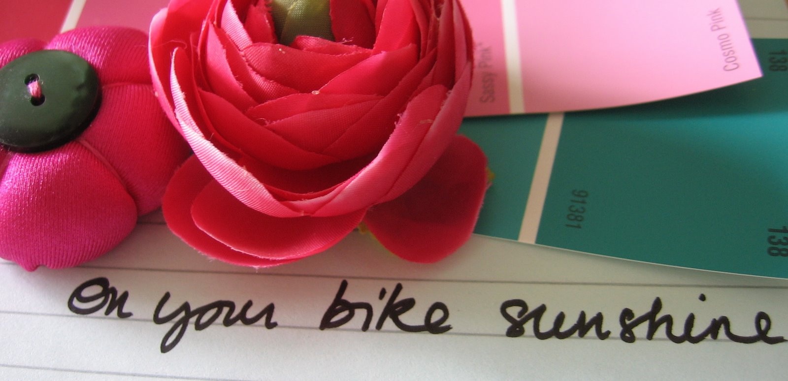
 Here is my working palette for the new house.
Walls will be white but they may be some grey, very light sage/mint green or egg shell where darker shade are needed.
Anyone who has ever tried using the colours between fuschia and blue will agree.
Just like when you shop for Alliums. They always end up having a tint quite different from the picture.
Screens and cameras just never seem to be able to tame them. So we'll pretend the first two are raspberry/burgundy and dark fuschia....(second swatch looks like the 2011 Pantone Honeysuckle but they is not what I was going for, so imagine something darker, a tad pinker than raspberry.)
Am not sure about the two last ones. Maybe a very dark purple rather than this odd indigo.
By the way, you know the easy colours math:
Colour+ white = fader shade of the colour
Colour+ water (to lessen total amount of pigment) = desaturate version of that colour (less concentrated)
Colour + its complementary colour = darker i.e. intensified shade of the colour
Colour+black = 'dirty' version of the same colour.
Read more here. (in French)

No comments:
Post a Comment